
Project: MetalHub.com redesign
Client: Tata Steel Digital Ventures
Role: UX & UI Design
About the Company
MetalHub was an online market comparison site for steel buyers.
Overview
The MVP of the MetalHub site was designed by Jordan Dalladay-Simpson & Arran Aver at BCGDV. After they left the project Lina Pio (UX) and myslef re-designed the site. Testing the previous version of the site with a group of MetalHub customers we created and tested two prototypes against each other and refined them into a new design.
Key issues that needed to be resolved
Drop off at sign-up
Hotjar recordings, Google Analytics and user testing highlighted a significant drop-off when users got to the point of sign-up. It was mandatory to sign-up to see prices.
Inaccurate prices before sign-up
The cheapest national price was being displayed to users before they signed-up, which led to disappointment after they had signed-up and they were seeing the same products at higher prices. We needed to capture their locations to display accurate prices earlier in the journey.
More clearly communicate the business proposition
Testing showed a need to more clearly communicate the business proposition: It's a price comparison site, saving people the effort of having to call around multiple suppliers. Some users assumed MetalHub was a standard metal supplier, not a network.
Users missing the dimension entry form
Some users struggled when entering the measurements of the steel they needed in the desktop view of the site.
Bulk price discounts needed to be more prominent
MetalHub offered tiered price breaks based on how much users were buying, we needed to communicate this more clearly.
Testing two new approaches
We explored two different approaches to improve the site and resolve the problems.
Prototype 1
This prototype used the site’s existing structure with some new additions. Each step in this flow was handled on a separate screen.
We experimented with two ways of capturing a user’s postcode. One using the browser’s inbuilt location sharing feature and another asking for it in an input field.
We also experimented with a tabbed approach at check out to try and make people aware of the other suppliers who may be able to service them across the MetalHub network.
Prototype 1 structure

Prototype 2
This prototype merged the screens in the flow above into a series of vertically scrolling sections across two screens. We also experimented with an approach where we asked users the minimum number of questions to sign-up: who they were and where they were. This smaller form was placed in the page as part of the flow rather than in a pop-up window.
Capturing people’s email and location in this way made the process feel smoother for users in testing with some commenting that they hadn't even noticed they had signed-up.
Prototype 2 structure

Prototype 1 - things that didn’t work
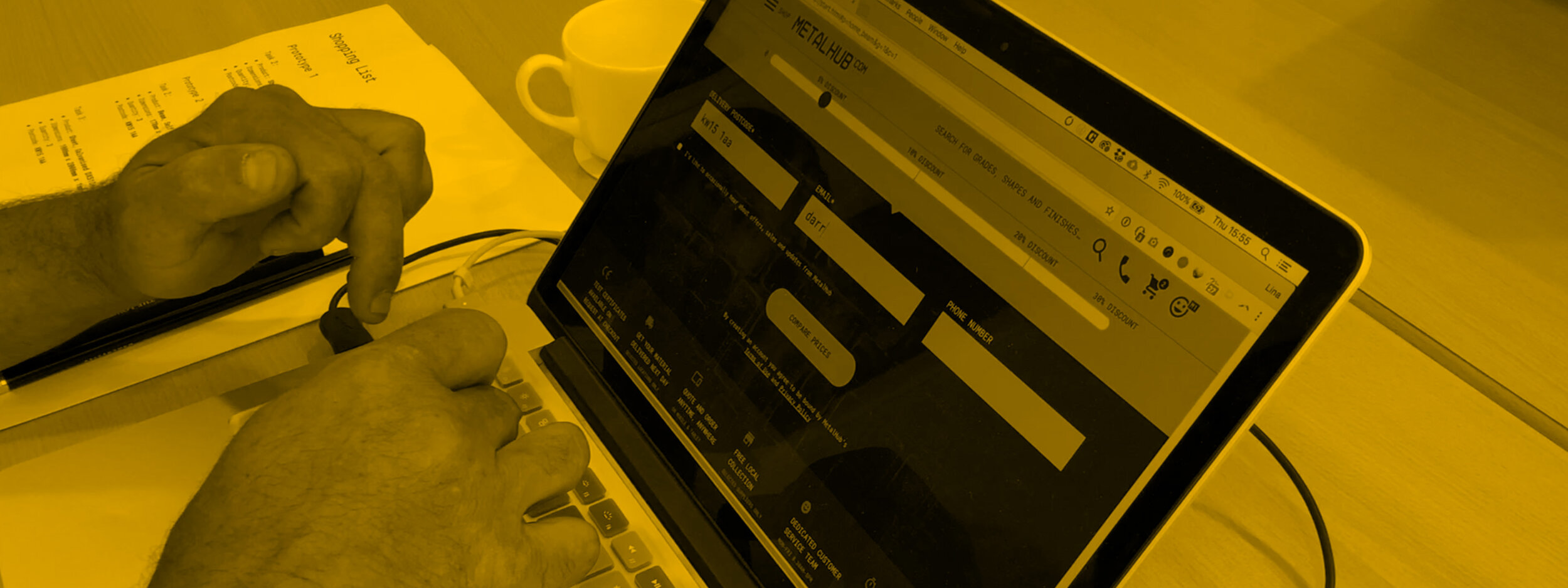
Asking users to share their location
Asking users to share their location via the built-in browser tool or a form input seen in the visual below didn't test well. People either missed the form entry or were suspicious of sharing their location using the inbuilt browser tool.
"I don't like giving location and details before I log-in to unknown sites"
Quote from testing

Basket tabs
Offering users other deals via tabs at check out didn't test well. We wanted to make it clearer to users that there was a network of suppliers available to them and that they were getting the most suitable deal but this set up didn't work. Most users missed them and when prompted found the number of them confusing.

Prototype 2 - things that did work
Sign-up issue
Hotjar recordings, Google Analytics and user testing were showing a significant drop off of users when they got to the point where they had to sign-up in the previous user flow. It's mandatory to sign-up to see prices.
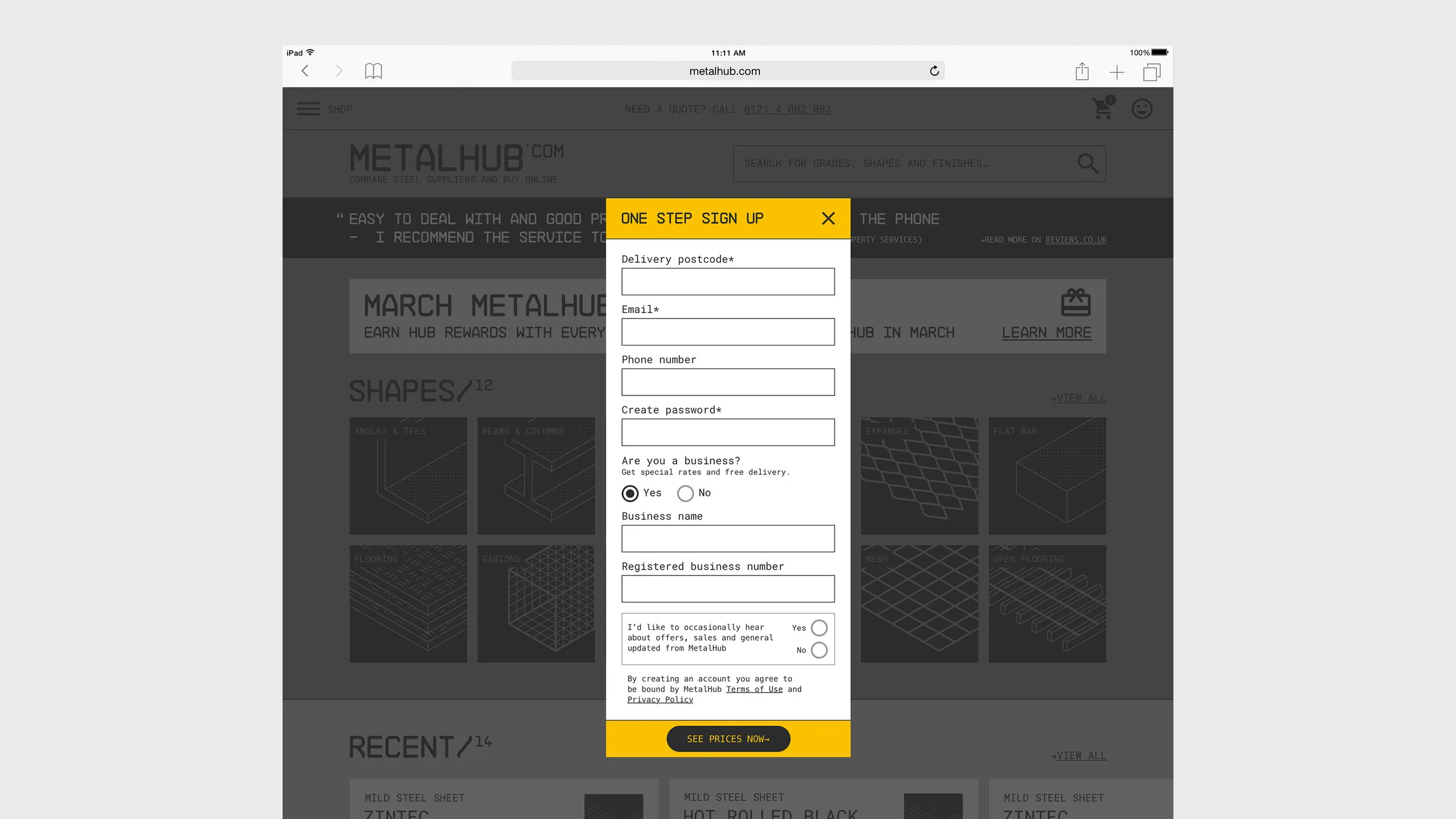
Sign-up solution
User testing showed that moving the sign-up form out of the popover window and integrating it into the screen along with reducing the number of required fields greatly reduced friction at this point. Sign-ups to the site increased by 33% with the introduction of this improvement.
“Did that ask me for my postcode? I didn’t notice”
Quote from testing

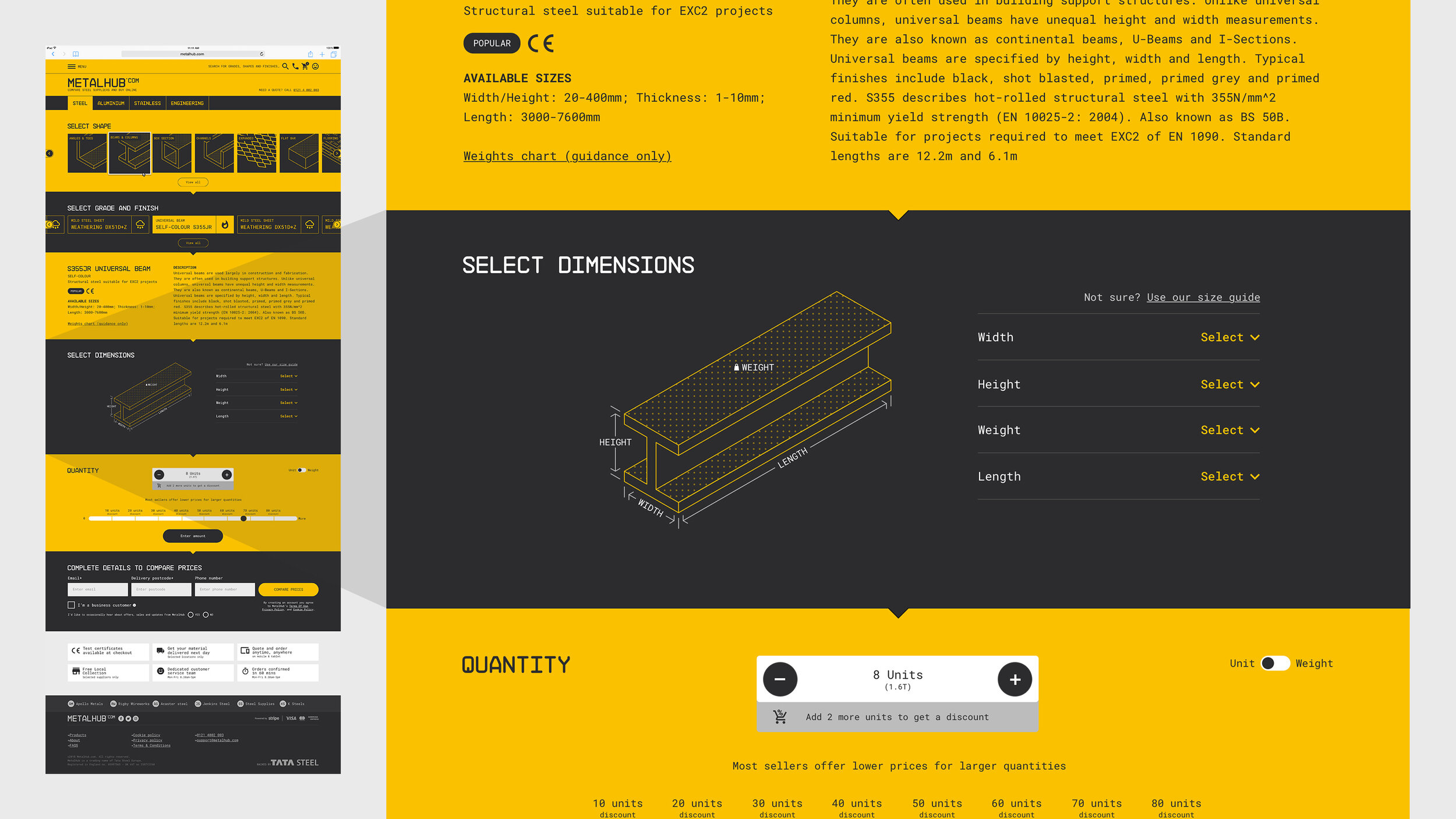
Dimension input issue
Hotjar recordings and user tests showed that people were missing that they needed to input shape dimensions at the top of the screen before they could search for metal products. Less experienced metal buyers also weren't sure what dimensions to input where.

Dimension input solution
Our data showed that users were more comfortable with how the dimension inputs were arranged on mobile so we used this pattern in the desktop view. The inclusion of a labelled isometric illustration also helped less experienced metal buyers work out what dimensions to enter in which field.
Cut to length issue
Some users were finding it challenging to enter their cut to length requirements.

Cut to length solution
Similar to the dimension input solution above, we found the inclusion of an isometric rather than a two-dimensional illustration helped clarify to users where the cuts they wanted would be made on the piece of metal they would be ordering.

Price breaks solution
The fact that users could get discounts when they purchased larger quantities wasn't very clear in the first iteration of the site. Allowing users to enter the quantity they required using this slider performed well in testing and clearly communicated at what quantities they could get discounts.

UI improvements
Form styling
The original form fields on MetalHub were quite small (32px high) and closely spaced together. I increased the height of them (62px high) and also made the confirmation and error states clearer.

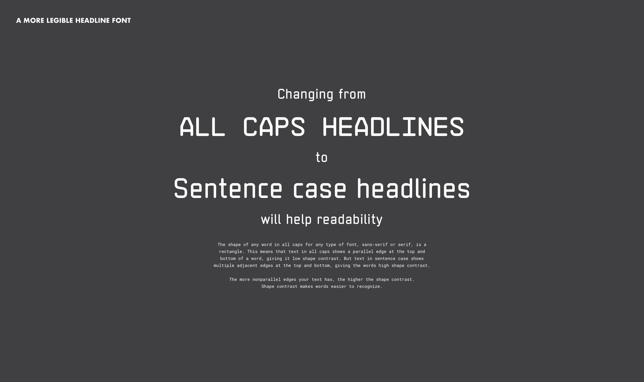
New headline font
The original headline font used on the site: NB Architekt worked well for our audience, the construction industry, but the fact it didn't have any lowercase characters was causing issues with legibility. I found a similar font called Neutraliser Sans that contains lowercase characters.
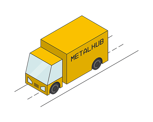
Isometric illustrations
Inspired by the original product illustration tiles that featured in the first design of the site. I created a collection of isometric illustrations for use throughout the site.

The results
In the weeks after the new site launch, registrations increased by 33%. There was also an improvement in how far users were going in the buying process, with a 20% increase of items being added to the basket.
4 of 5 • Next Project