
Togetherall - Registration & Onboarding
01/13
Client Togetherall
Role Lead designer
Team Designer (Me), Product Owner, Business Analyst, QA, 4-5 Developers
Timeline April 2021 - October 2023
About the company
Togetherall is a peer-to-peer, mental health community, where members can anonymously share their problems and help others.
Project aims
•Make user registration safer.
•Make user onboarding more engaging and impactful.
Project status:
•Registration: Shipped.
•Onboarding: Concept work, not shipped.
Skills used
Research, gathering requirements, data analysis, competitor analysis, Miro workshops, information architecture, wire framing, prototyping, user interface design and user research testing.
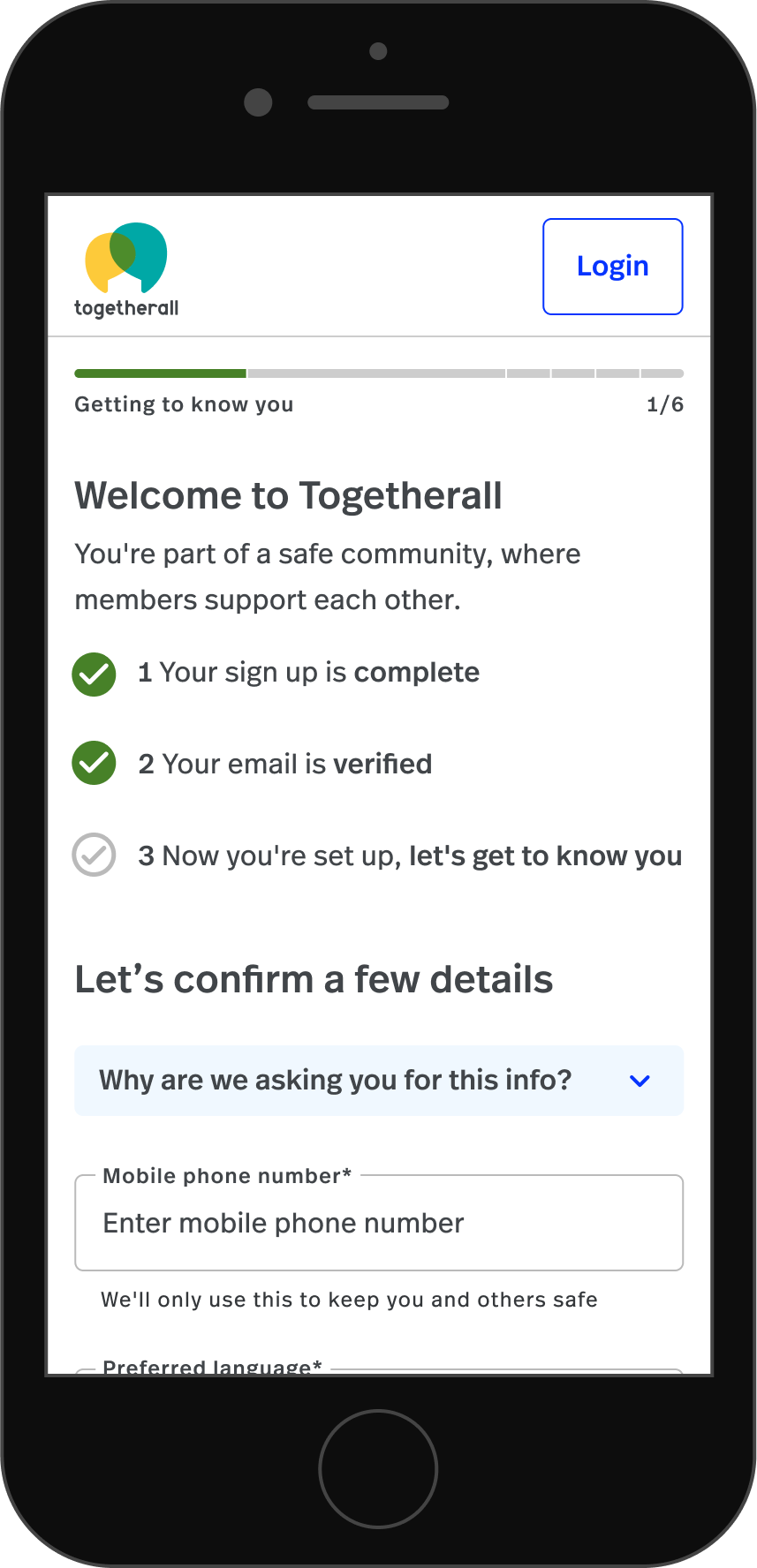
Registration overview
02/13

Safety first
The key motivation for this project was improving member safety, the clinical team needed a more detailed picture of people's mental state at the time of sign-up.
What we needed to capture
•Custom client questions.
•Who they are.
•How they are feeling.
•What they are experiencing.
•How long they have been experiencing these issues.
Key numbers
03/13
28%
We needed to ask users 28% more questions to increase safety.
36%
Needing to present users 36% more answer options to increase safety.
The challenge - Registration is long
04/13
The registration phase is the longest part of the onboarding process, how do we keep people engaged and motivated?
01
Some users were complaining about the number of questions they had to answer and we needed to add more for safety.
02
Some users were suspicious of why we were asking so many questions and wanted to know how we were handling their data.
03
Users on the previous set-up

“I'm feeling quite tired from the lists.”
Anonymous tester

“I'm not paying too much attention to any of this, I just want to get it over with”
Anonymous tester

“I feel very far behind”
Anonymous tester
05/13
Restructuring to make the process feel lighter

06/13
Some key improvements
Celebrating key achievements
Highlighting the steps they’ve achieved to maintain motivation and reduce drop-off.

Clear messaging on data handling
To ensure transparency and address user concerns about data usage, we implemented an information panel on every screen.
Following up on drop-off
We implemented follow-up emails to re-engage drop-offs and increase conversion.

Getting the progress bar right
Previous version
The previous version of the progress bar wasn’t clear enough.

Iteration one
Some users found the number of steps off-putting during testing.
Iteration two
Restructuring the IA reduced the number of steps. Adding numbers improved accessibility.

Improving communication
Before
Headlines like ‘I am’ weren’t clear or instructional.


After
Clearer headlines with supporting sub-headlines.
Something I would have liked to have explored
07/13
Something I would have liked to have explored
I would have liked to have given users view-only access to the site, before they fully registered, to get them onboard more quickly.
Users could have fully completed their profiles when they wanted to post content.

Registration results
08/13

Improved safety
The clinical team were able to handle member safety emergencies more efficiently.

Maintained high completion rates
We maintained the high sign-up completion rates >90%, despite having to increase the number of questions to improve safety.

The new reminder emails worked
They had open rates >70% and led to a significant number of sign-ups.
09/13
The previous onboarding set-up
Issues with the previous version
Event tracking and Hotjar videos highlighted that the onboarding tour was being skipped by a significant number of users.
The tour was only being presented to users once.
The copy wasn’t benefits-driven.

Previous version
10/13
An interim onboarding solution
An interim solution
I put together an interim solution to improve what we had, while we researched other solutions, it was shorter, more instructional and benefits-driven.


Seeking clarity
11/13
Getting user input
We ran an online survey with members who had signed up but only visited Togetherall once.
We asked these users to share their thoughts on our onboarding experience and what their expectations of the service were.
We then sorted the feedback into themes in Miro.

Exploring different onbaording solutions
12/13
Concept 1
A persistent homepage module
This module would remain on the homepage and celebrate each time a user completes a step, it would then guide them onto the next step, gradually touring them around the site and recommending relevant features and content.

Concept 2
A homepage feature tour
A module that would remain on the homepage and signpost where users should go to find features and content.

Concept 3
Intelligent cross-promotional panels for new users
Based on a user's number of visits, and their behaviours, we would recommend them features and content on the homepage.
Concept 3 continued
Intelligent cross-promotional panels for established users
Based on a user's number of visits, and their behaviours, we would recommend them features and content on the homepage.

13/13
Where I got to with onboarding

It was left in the concept phase, it’s untested with users.

The ideas were well received by key stakeholders.