Petgevity — Customer account redesign
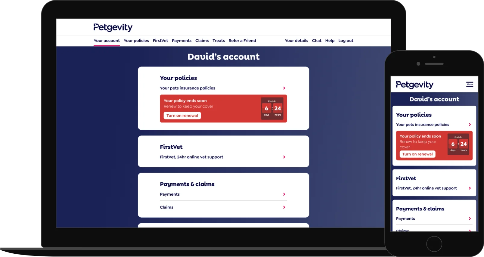
Project details
About the company
Petgevity are an award-winning UK-based pet insurance provider, who specialise in pre-existing medical cover for cats and dogs.
Project aim
Redesign the customer account area and transition all offline journeys to digital, self-serve experiences.
Skills used
User research, data analysis, competitor benchmarking, information architecture, wireframing, prototyping, UI design, usability testing.
My role
Design Lead.
The team
Designer (Me), Product Owner, Product Manager, QA, 7 Developers.
Timeline
March 2025 – July 2025.
The challenge
- Transition all previous offline journeys to digital, self-serve experiences.
- The account area is information-heavy, how might we present things in a digestible and user-friendly way?
- Increase opt-in rates for auto-renewal of insurance policies.
- Users must review all policy details to make a single change, how might we improve this process?
- Claims and renewals involve complex, multi-page journeys, how might we simplify these experiences?
Numbers that needed to be improved
Calls are expensive to manage: they cost the business more than £2.50 per call to renew peoples policies.
40% of all calls received were from people amending their insurance policies.
25% of all calls received were from people renewing their insurance policies.
(Numbers have been adjusted to maintain confidentiality)
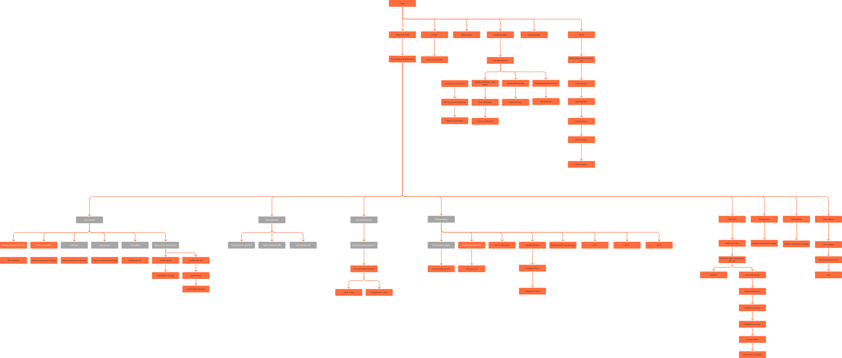
Working out what’s going on
The first thing I do on large projects like this is map out and understand what’s going on.
What’s working and what isn’t? From there, I look at potential architectural improvements, getting the foundations right first.
My approach
- Analysing current user behaviour using Contentsquare and Hotjar.
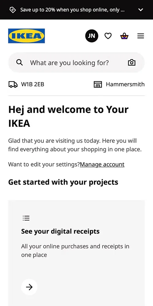
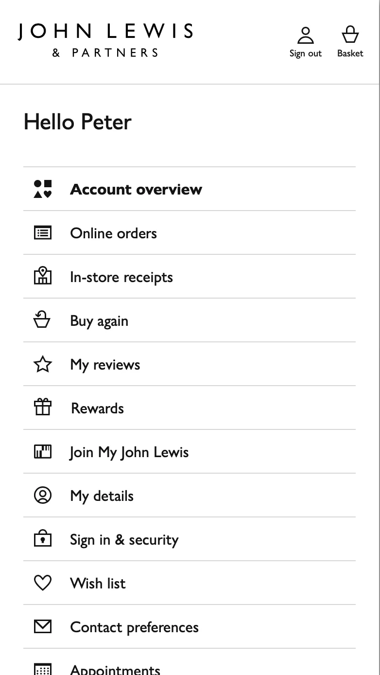
- Researching competitor account areas, focusing on key tasks like policy renewal.
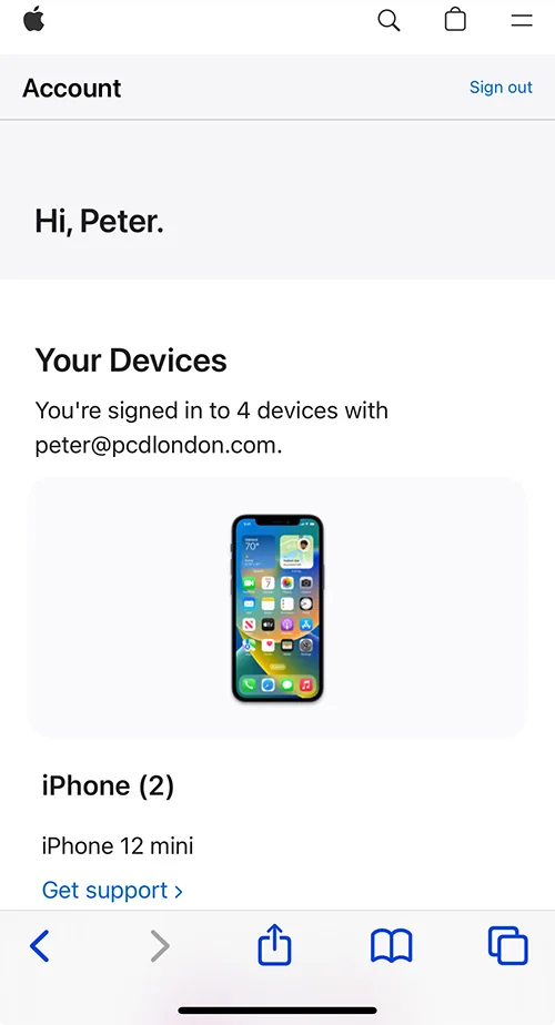
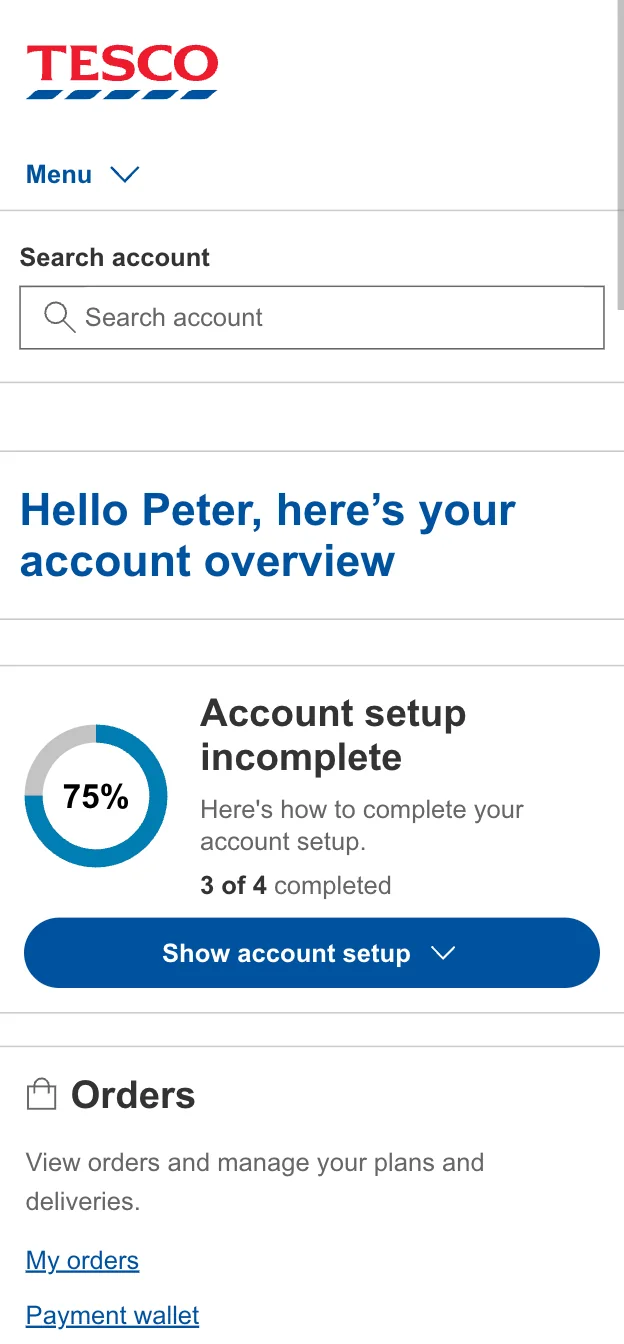
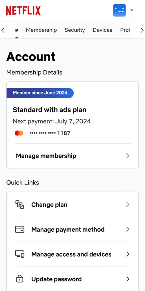
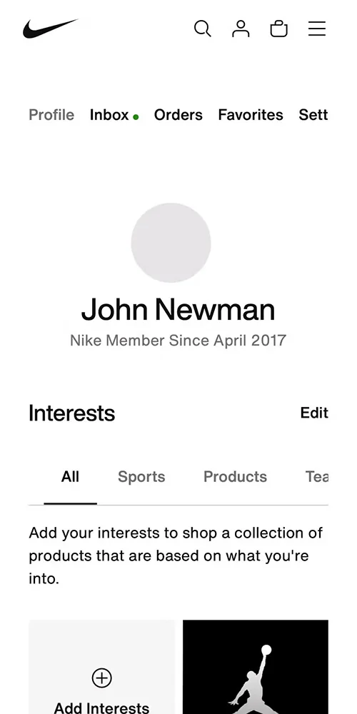
- Exploring account areas across different domains, with an emphasis on information architecture and elegant navigation solutions for large-scale sites.
- Creating a prototype to put in front of users as early as possible for feedback and iteration.
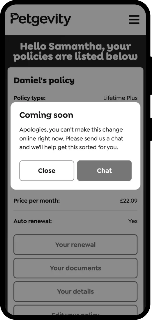
Some features were offline only
A big opportunity for improvement was making all account actions accessible online.
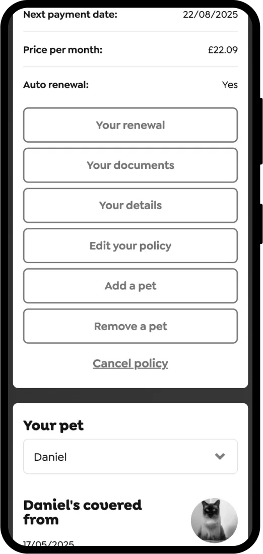
Poor visual hierarchy
The site used clusters of buttons like this, which made it hard for users to identify the primary actions.
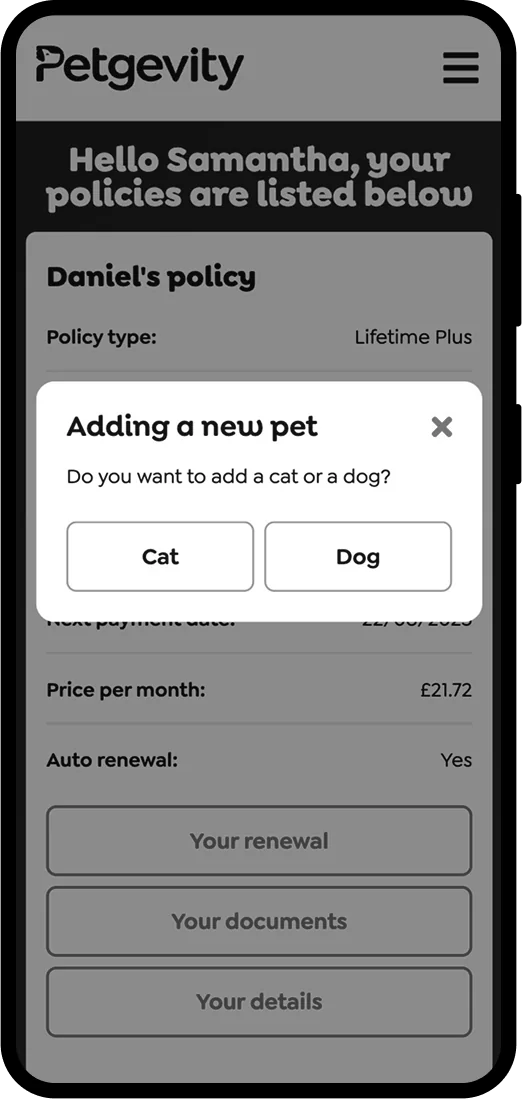
Inconsistent patterns
Similar processes were handled using different UI patterns, some appeared on screen, while others used popovers, leading to an inconsistent experience.
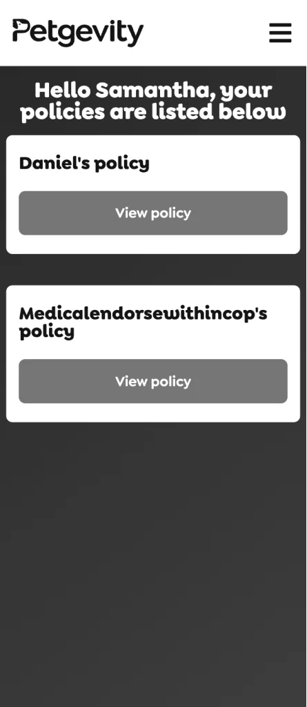


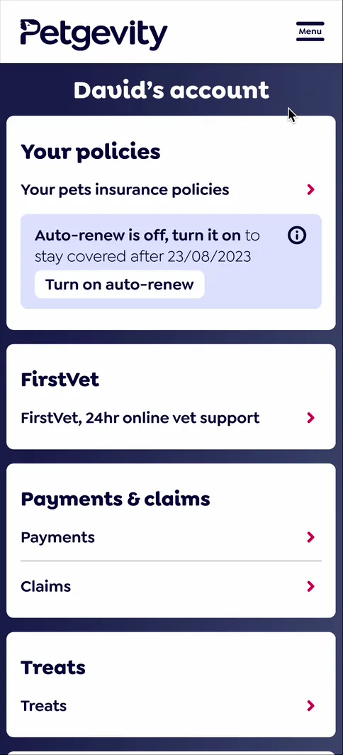
Redesigning the account home screen
The previous version of the home screen only listed active insurance policies. I updated it to provide an overview of the entire site and highlight all available features.
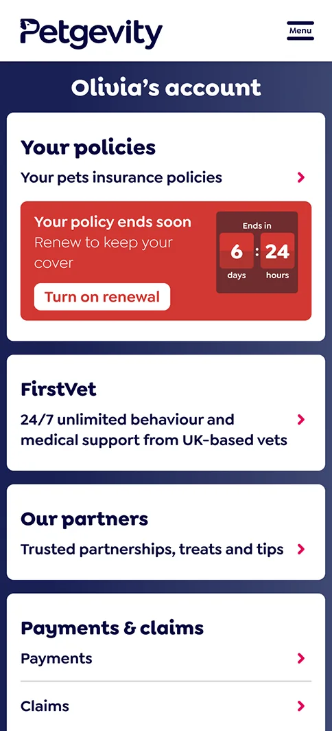
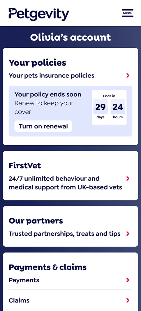
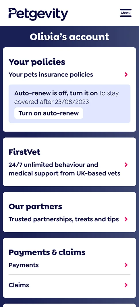
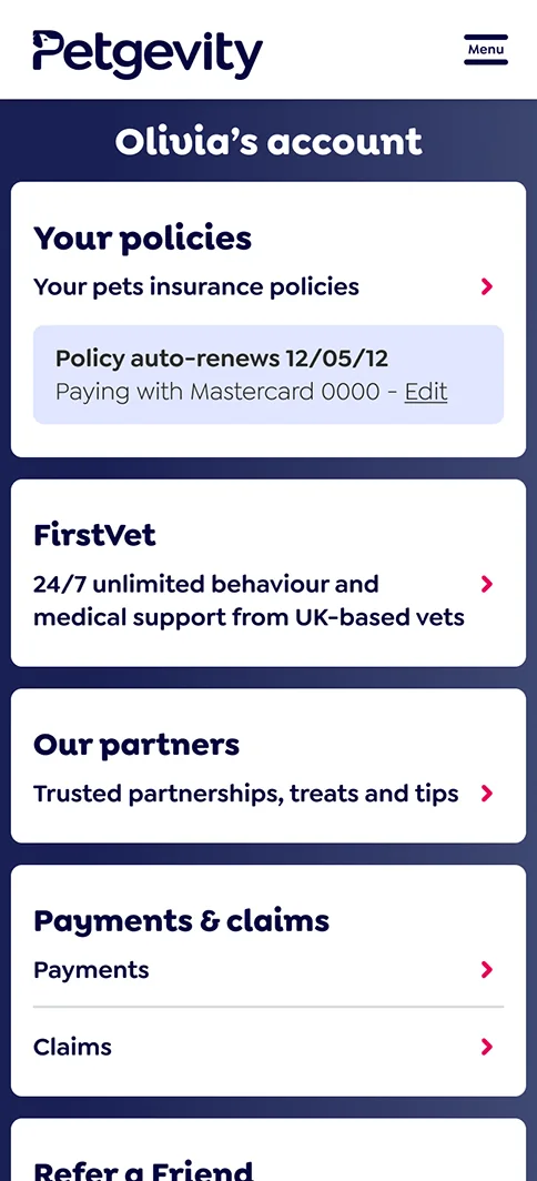
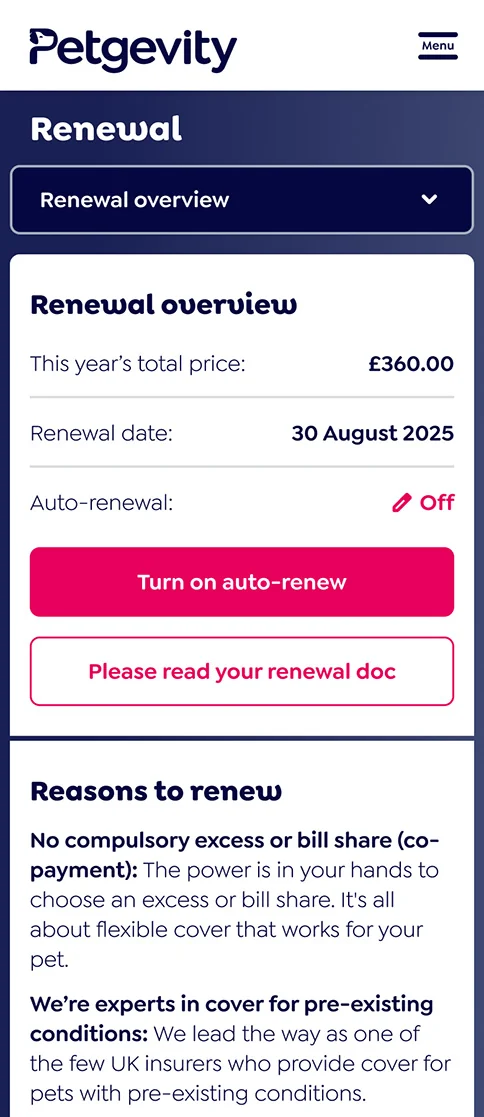
Clearly signposting people’s insurance policy renewal status
We added countdown message banners to create urgency and encourage customers who opted out of auto-renewal to reconsider.
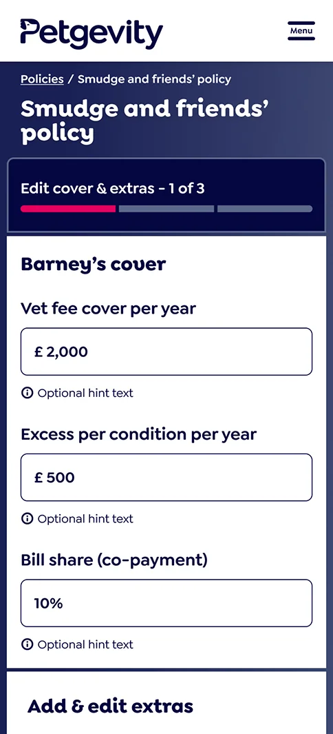
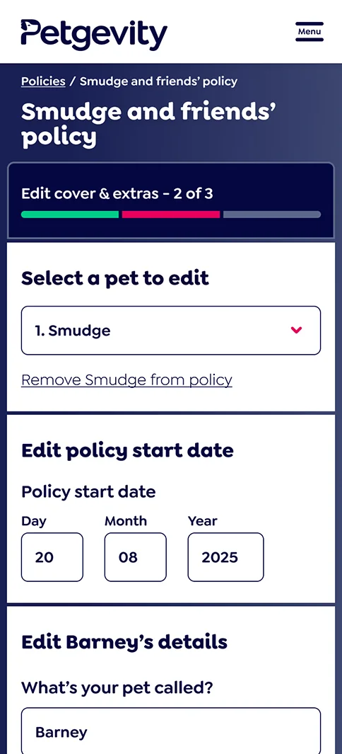
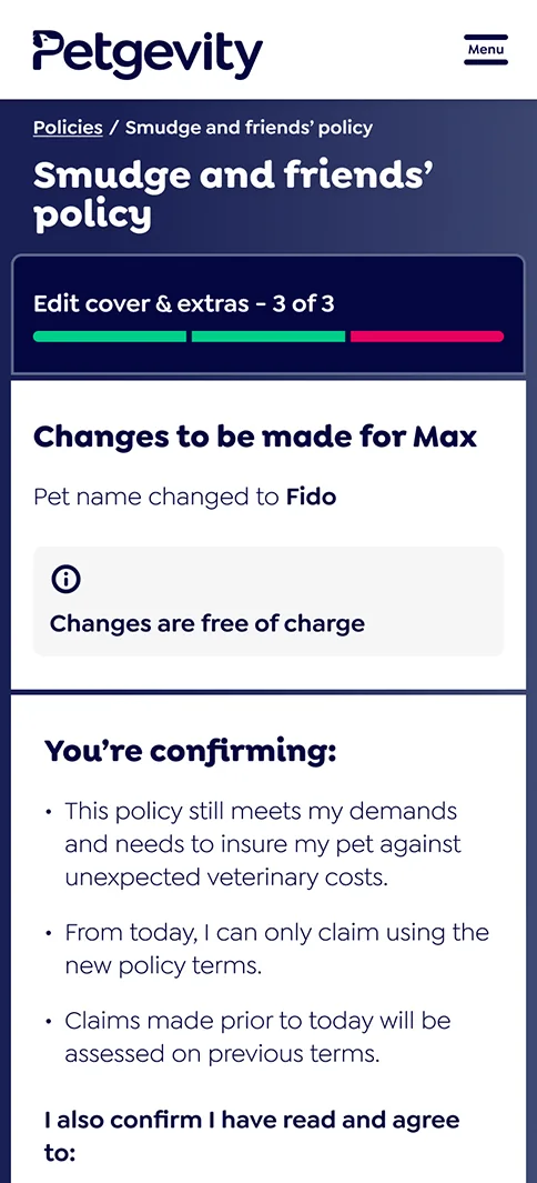
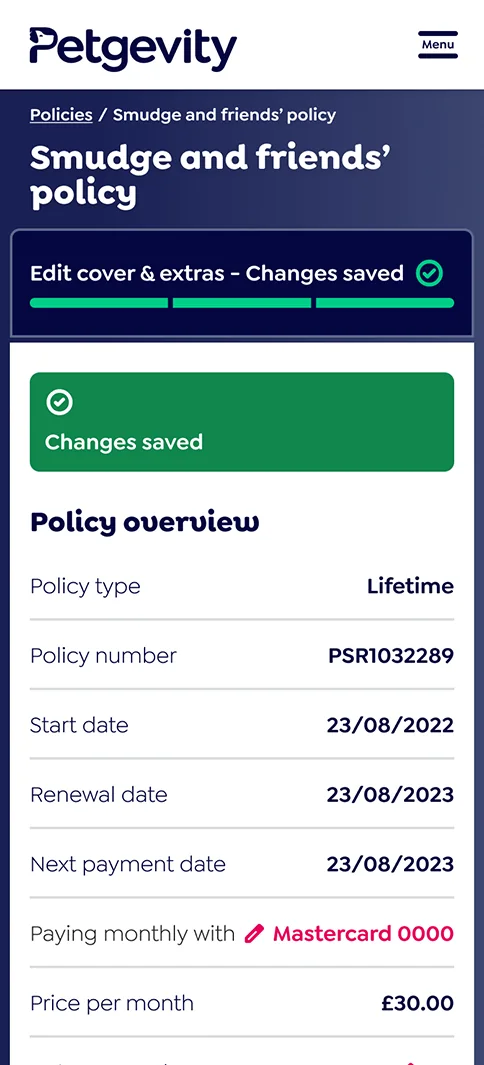
Signposting tasks and
communicating progress
To meet FCA compliance, customers must review all their policy details when making account changes. This wasn’t clear previously, so I added progress trackers and strong success messages.
Redesigning and restructuring the mobile side navigation
The previous version of the mobile navigation only linked to top-level pages. I expanded it to allow navigation to all pages. While all journeys can be completed using in-page links, this side navigation acted as a fallback and was used by 25% of mobile users during testing.
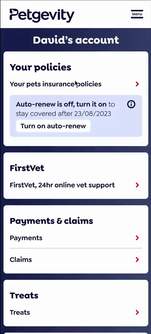
Prototype for testing
This is a screen record of the third iteration of the Figma prototype we tested with users in Maze.
Checking we’re meeting users’ needs
with help from vulnerable customers
The final iteration of the prototype was successfully tested in Maze
with vulnerable customers, achieving a 95% task completion rate.
We tested with:
- People with neurodivergent and mental health conditions.
- Older adults, aged 66–99.
- Users with physical disabilities and reduced mobility.

Key numbers from user testing in Figma with Maze
30 tests completed across 3 prototype iterations.
9 tests completed with vulnerable customers.
2 key new journeys, policy renewal and edit policy validated.
1 key navigation issue found and fixed.
4 minor issues found and fixed.
Key issue discovered in testing
The first iteration of the mobile prototype used drop-down menus for site navigation, which caused some confusion.
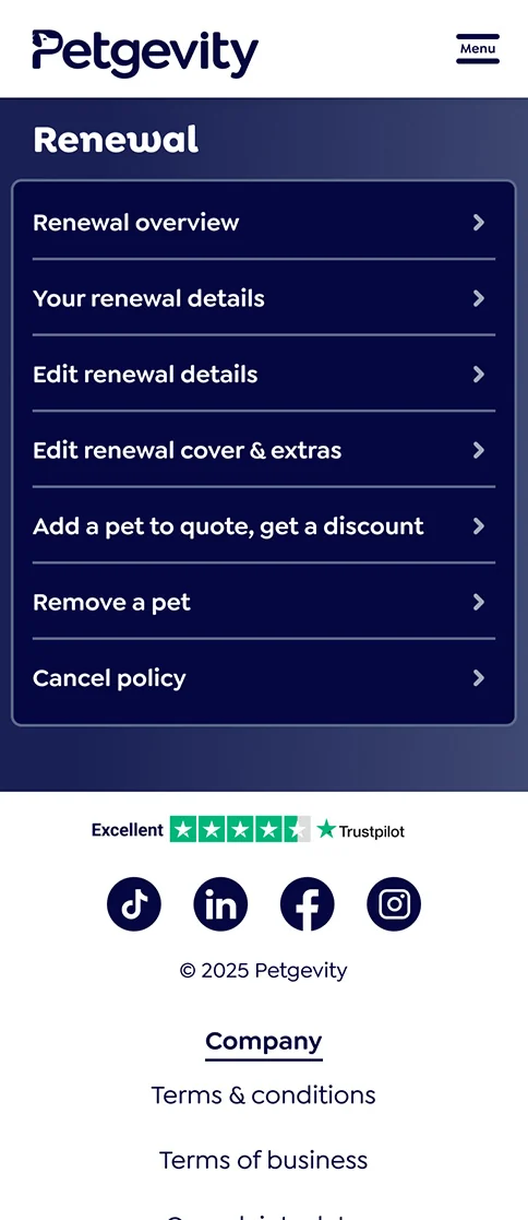
Displaying the navigation options on separate pages in the mobile version performed significantly better during testing.
Results since the August 2026 launch
Six figures saved
annually in operating costs due
to reduced phone calls.
50% fewer daily requests
to edit renewals as a result of
customers self-serving online.
(Numbers have been rounded to maintain confidentiality)