Togetherall - Sign-up redesign
01/15
Client Togetherall
Role Lead designer
Team Designer (Me), Product Owner, Business Analyst, QA, 4-5 Developers
Timeline April 2021 - October 2023
About the company
Togetherall is a peer-to-peer, mental health community, where members can anonymously share their problems and help others.
Project aims
•Make joining safer, faster and easier.
•Make the business proposition clearer to everyone joining.
Skills used
Research, gathering requirements, data analysis, competitor analysis, Miro work shops, information architecture, wire framing, prototyping, user interface design, user research testing.
02/15
Key wins

Improved safety
The clinical team were able to handle member safety emergencies more efficiently.

Fewer one time users
Reduced the number of one time users by 12-15%.

Maintained high completion rates
We maintained the high sign-up completion rates >90%, despite having to increase the number of questions to improve safety.
03/15
Key numbers from 2020
90%
90% of users completed registration. 10% drop off between verifying their email address and completing.
40%
40% of all users visited the platform only once.
10
At 10 minutes only 43% of one-time users remained on the platform.
04/15
Seeking clarity
Learning from users
Getting feedback via email, posts on the Togetherall site, Pendo surveys, market research, NPS surveys, Hotjar and remote unmoderated user research sessions via UserBrain.
01
Regular workshops
Holding separate and blended workshops with internal teams: Clinical, Sales, and Operations.
02
Exploring the data
Using data from Sisense and Pendo to inform decision-making.
03
04
Taking everyone on the journey
Having regular check-ins throughout the project with key stakeholders.
05/15
Workshop insights
How might we…
Make the sign up process as quick as possible.
Make it feel like it isn't too long.
Streamline the sign-up process.
Make it clearer that Togetherall is only available to specific groups of users, not everyone.
Make the first screen in the process less visually busy.
Give members helpful context about why we need the information.
Make the sign-up flows for all users more consistent.
Align the new design to the new brand guidelines.

06/15
Using Personas to focus impact
These personas were built using: Data, User research interviews, Member surveys.


07/15
Competitor analysis
Researching sign-up and registration processes with...
Direct competitors.
Other companies in the broader healthcare space.
Social media sites.
Any sites with long or complex onboarding processes.

Restructuring to increase conversion
08/15
The previous set-up asked users non-mandatory questions before capturing their email addresses which was creating drop-off.
We needed to ask users the fewest questions possible to confirm eligibility and collect their email addresses, that way they could be contacted if they dropped off later in the process.

09/15
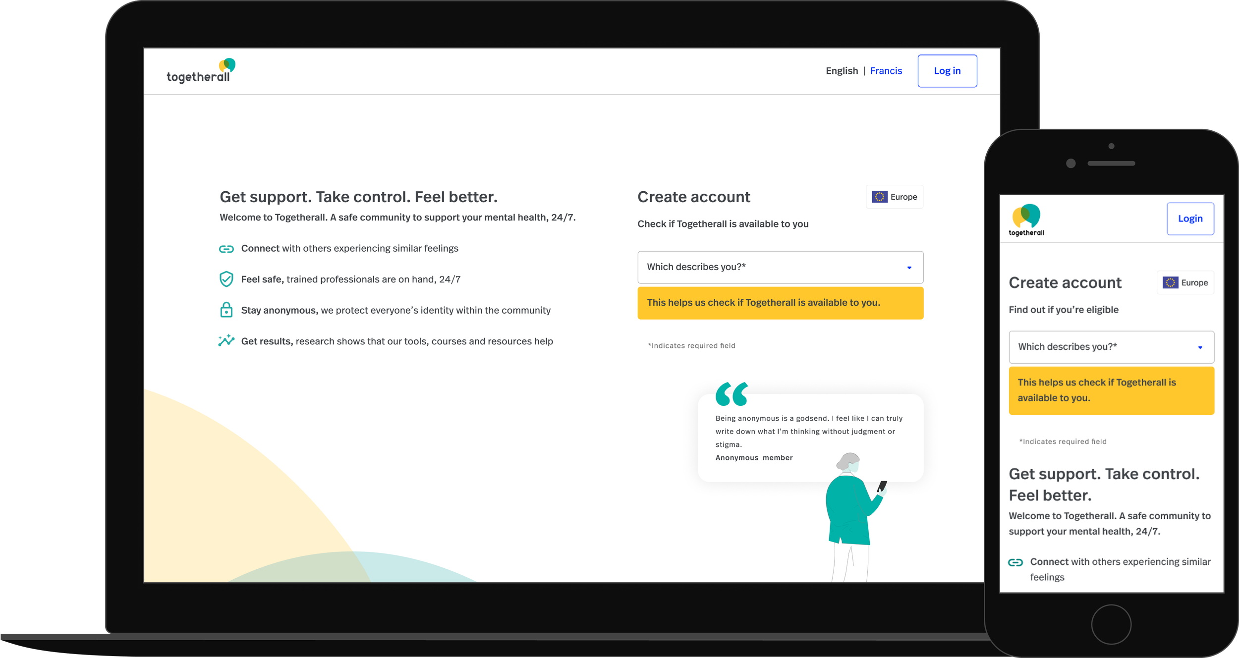
Sign-up landing page

Issues with the previous sign-up landing page
1 The route selection tiles took up a lot of space, particularly on mobile.
2 The copy was functional and lacked incentives for the user.
3 I felt the page was missing the why, the sign-up process is long why should users embark on it?
Landing page improvements
1 The addition of concise benefits lead supporting copy.
2 A direct instructive H1 headline.
3 A tidier, more scaleable dropdown menu to select sign-up routes.
4 The addition of a new route to a soft landing page for non-eligible users.
5 The addition of member quotes and proof points to motivate users throughout the journey.
6 Updating to the new branding.
12/15
Keeping users motivated
Adding inspiring quotes and proof points to keep users motivated
The whole onboarding process is long, we needed to encourage people to keep going.
I included real quotes from members.
I included key benefits with numbers from member surveys.

10/15
Sign-up
The previous sign-up landing page
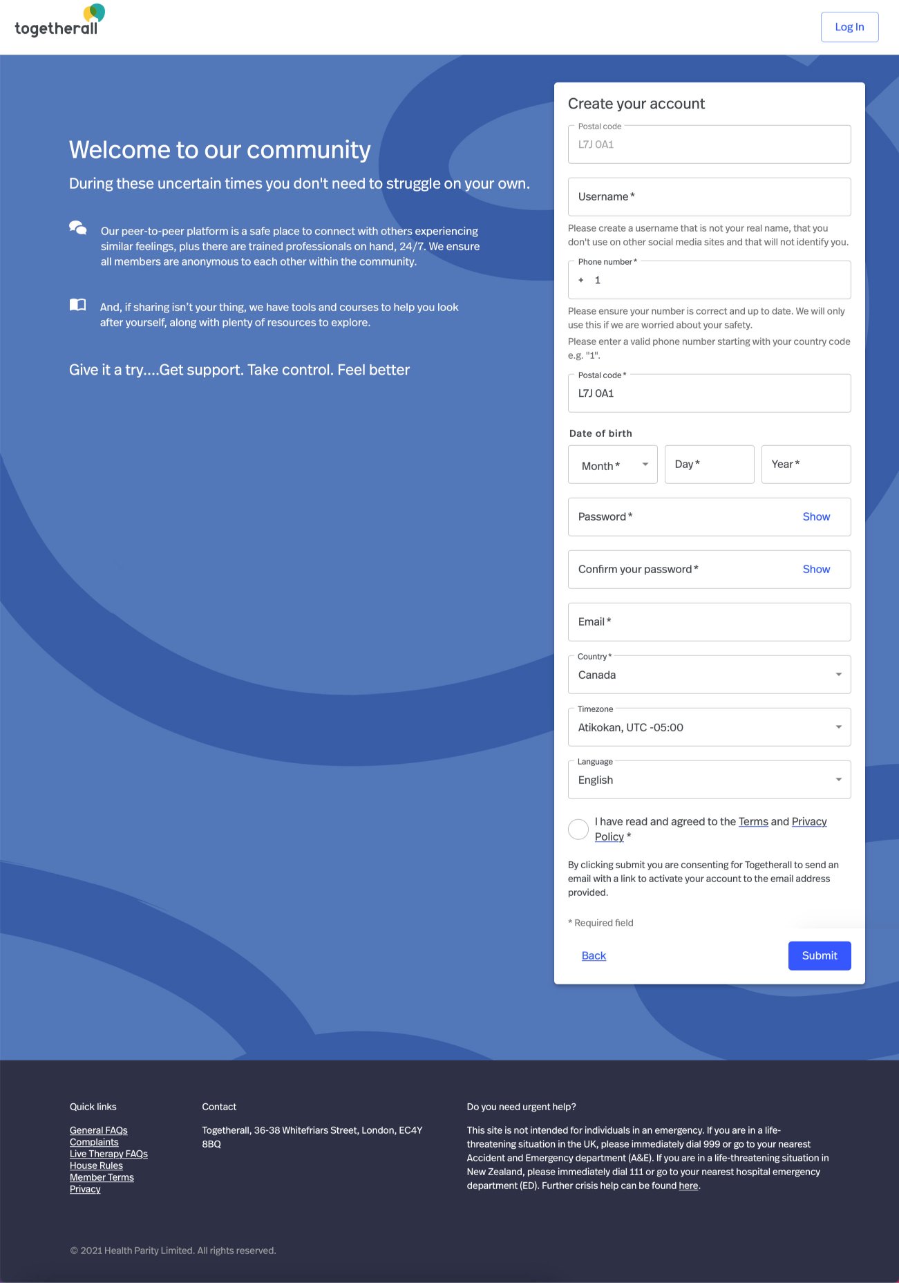
Questions:
Before we capture a user's email do we need all these questions?
Do we need to capture a user's phone number before their email?
Do we need two password fields?
Why do have a country selector if they have already entered their postcode?
Why do we need to capture a user's timezone?
Do we need two T&Cs messages?
Needing to compromise

What I would have liked to do
Ideally, I would have liked to have registered users with two input fields, email and password.
However, this wasn't possible due to Togethrall’s business model. Organisations pay for memberships and gift them to users, this means that users must be verified before they join, unlike open platforms.
Members also had to have anonymous usernames and share their location for safety.
The new design

Key improvements
1 A direct instructive H1 headline.
2 Reducing the number of questions at this point.
3 Adding a random user name generator to ensure anonymity.
4 Using a progressive disclosure approach to make the form less intimidating.
5 The addition of member quotes and proof points to motivate users throughout the journey.
6 Updating to the new branding.
The username generator
11/15
Why was it needed?
01
To improve member safety, Togetherall is an anonymous community.
To guarantee usernames contained no personal identifiers.
02
To reduce the workload on the clinical team, eliminating the need for them to monitor and edit any unsuitable names.
03
Trying & testing iterations


Prototyping the username generator

Getting the numbers right
Miki built a basic HTML prototype as a proof of concept. Having two words, followed by 2 digits, generated over 23 million possible combinations.

Testing a HTML prototype with users
We did two rounds of testing with a frontend HTML prototype on our staging site.
Quotes from testing the username generator

"I saw that it was automatic and I thought sweet, they took care of one step for me.”
Anonymous tester

"I liked it... because then it was easy to be anonymous"
Anonymous tester

"I felt it was really easy and simple, especially since the point of Togetherall is to be anonymous"
Anonymous tester
13/15
Other improvements

Soft landing users on the unhappy path
Not all users are eligible for Togetherall so we created a soft landing page to better communicate to this group of users.
Reminder emails
Implementing new reminder emails to reduce drop off.

Quotes from testing sign-up
14/15
I conducted three rounds of unmoderated User Testing via UserBrain.

“It doesn't feel as onerous”
Anonymous tester
“I wonder if that's there to stop you skipping and get you more involved in the process?”
Anonymous tester on the proof points
“For me, it’s definitely an improvement”
Anonymous tester
A problem we discovered

People were missing the proof points
The proof points were being missed by some users so we locked them to the bottom of the viewport to make them more prominent.
15/15
The results

The user name generator
Username change requests to the clinical team were reduced by >90%

The new reminder emails worked
They had open rates >70% and led to a significant number of sign-ups.
Improved safety
The clinical team were able to handle member safety emergencies more efficiently.

Fewer one time users
We reduced the number of one time users by <12-15%.
Maintained high completion rates
We maintained the high sign-up completion rates >90%, despite having to increase the number of questions to improve safety.
2 of 5 • Next Project